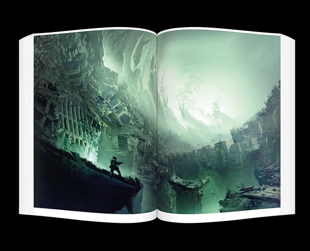
We are very proud to present Killzone Visual Design, a comprehensive art book celebrating 15 years of visual design history of the Killzone series. The book is published by the digital art experts at Cook & Becker, and explores the richness of the Killzone game world in colorful detail. We sat down with key artists of our studio and asked them about some key moments and anecdotes of those 15 years.
Art Director Roy Postma was one of the first artists to work on the original Killzone. He is quick to point out that the aesthetic of its main antagonists didn’t just spring into existence fully formed. “The whole look of the Helghast is something that really evolved over time,” he explains. “We went through a lot of history and photo books to gather inspiration and reference materials for our enemy character. We didn’t set out to create the most iconic look possible — it was more like, okay, how can we make this menacing, sort-of functional, believable character.”
One of the key things when looking at Killzone are the glowy red eyes of the Helghast. This wasn’t a style decision from day one — the red-eyes came into play after a game tester complaint that it was difficult to spot the Helghast against dark backdrops. “It doesn’t seem very camouflage-worthy,” Studio Art Director Jan-Bart van Beek notes, “but the eyes were only added after the game was in development, and we quickly realized it made the game much easier to play.”
Lead Visual Designer Roland IJzermans recounts the example of the vehicle chase over the Helghan ice fields from Killzone 3. “The sequence just so happened to be in development while it was winter time in the Netherlands,” he says. “I went out and I saw these ice skaters out on the lakes, and I thought that was a magnificent view, so I tried to redesign one of those into something that matched the Killzone universe.”
But when he presented his initial designs to the Art Director, it took all of a minute for the idea to be shot down. “He was like, whoa, is this Helghast? This isn’t Helghast!” Roland realized the Art Director was right — Helghast machines were typically designed as overpowered, opting to tear through nature rather than sail harmlessly over it. “So I sat down with that given information and we came up with the Ice Saw,” he says. “It was a much bigger, much more robust vehicle with chainsaw caterpillar tracks that tore into the ice. Suffice to say it quickly made it into the game.”
Killzone Visual Design is filled with lavish, full-color spreads and insightful comments and anecdotes from Guerrilla’s own visual design artists. It’s a must-have for Killzone fans and visual design aficionados alike. You can pre-order your copy from the PlayStation Gear store today.
Exclusive Car Review at www.automoview.com