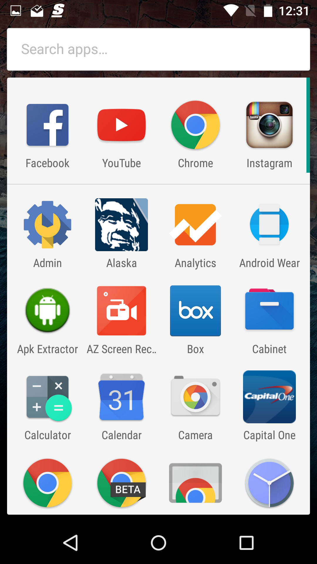
We are just now diving into the new Android M Preview 2 that was released moments ago, but already, some things are standing out that have been tweaked. Everyone remember the vertically scrolling, alphabet-heavy app drawer that was included in Preview 1? Google already changed it quite significantly. We aren’t sure if they changed it over the criticism others placed upon it, or if that was simply a test of one layout before another test of a newly tweaked layout began.
So what changed? Not much, but it does seem more cleaned up. It still scrolls vertically. We also still have the four more recently used apps at the top of it. We even have a search box, so that you can quickly locate apps.
What we don’t have are the odd groupings of apps into alphabetical categories. Instead, we have a much more traditional looking app drawer that is always 4-apps wide. You can still quick scroll by letter if you grab the right edge, but you no longer have those letter indicators throughout the left side.
You can see a comparison of the two above, with the Preview 2 drawer on the left and the original Preview 1 drawer on the right.
What do you think of the small changes?
Android M Feature: Google Already Tweaked Preview 1’s Odd App Drawer is a post from: Droid Life
Related Stories
Gadget Reviews: mamaktalk.com
Car Reviews: automoview.com
Entertainment News: 38today.com
Today's Promotions: freepromotoday.com
Gossip News: 38now.com
[Recommended Post] Best natural looking Malaysian Girl - Photo Album

